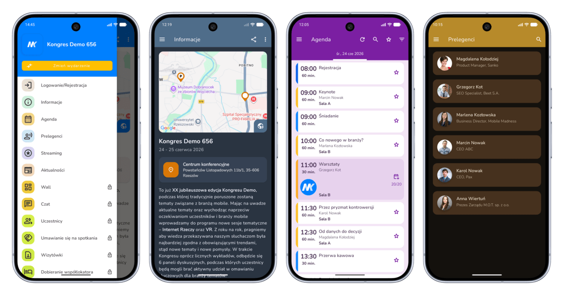
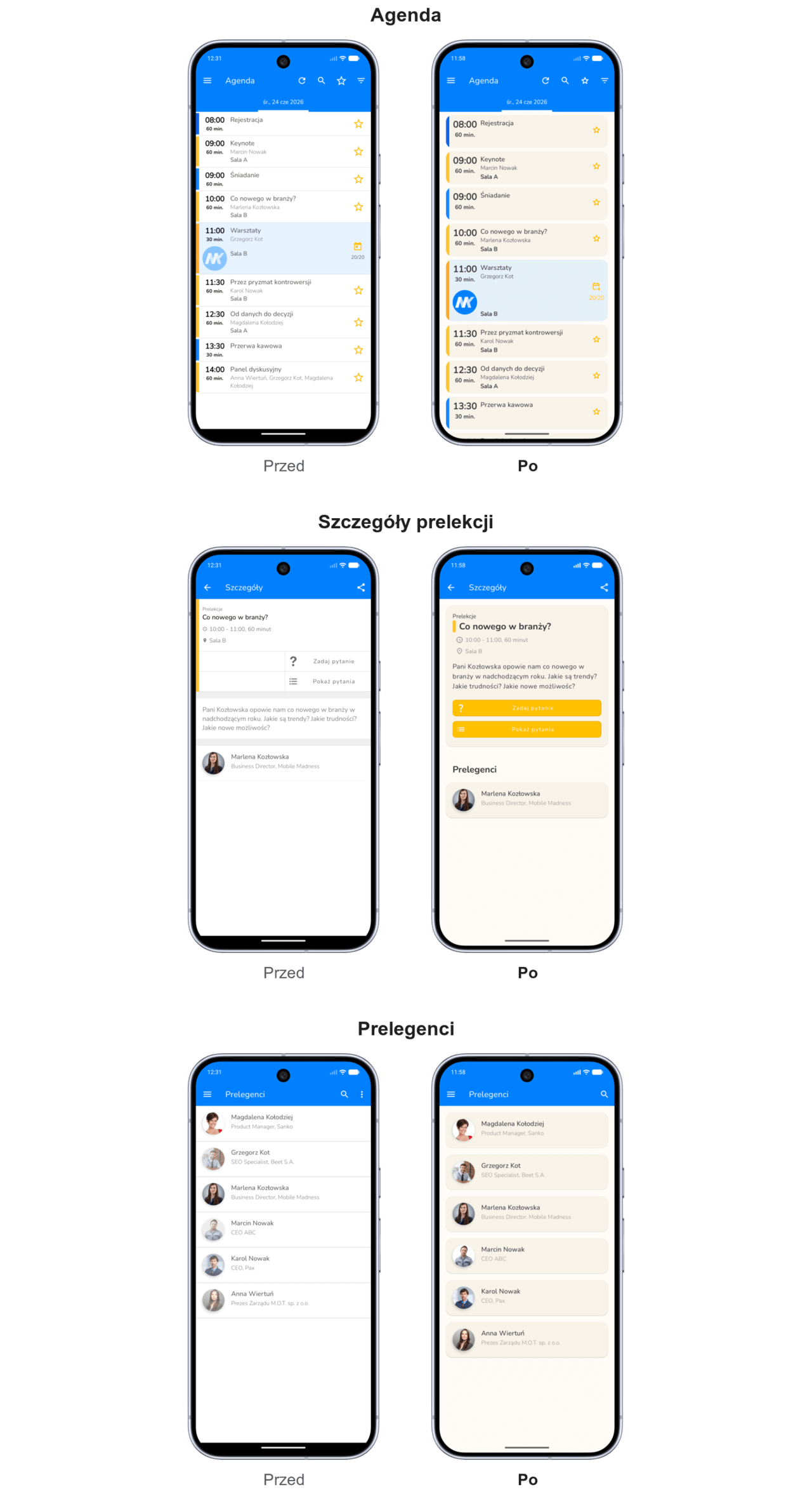
Our app has been given a new look, with a clearer, more contemporary layout: bolder headings, calmer backgrounds, tabs, more distinct buttons and more consistent icons. The default colour scheme is warmer and more subdued: a light background, soft tab surfaces and contrasting text. All views have been standardised, making it easier to quickly browse the agenda, speakers, partners, news and materials during the event.
Look 2.0: a new settings panel for the events app
We’ve added a new way to configure the mobile app. You can now adjust the style, menu, adverts and photo booth all in one place, with a live preview and greater control over how the event looks from the user’s perspective.
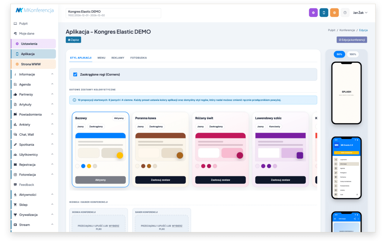
The 2.0 interface organises the app’s settings, which were previously spread across numerous fields and sections. The new panel has been designed for the new version of the mobile app, which is being rolled out in stages; it therefore allows you to work safely alongside the previous interface and transfer the most important settings from the 1.0 interface.
Pre-set colour schemes and custom colours
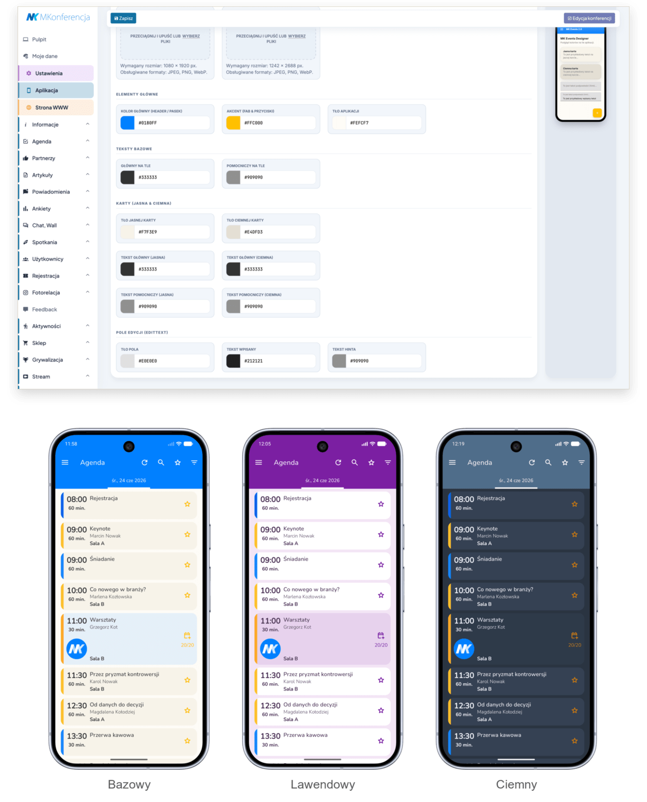
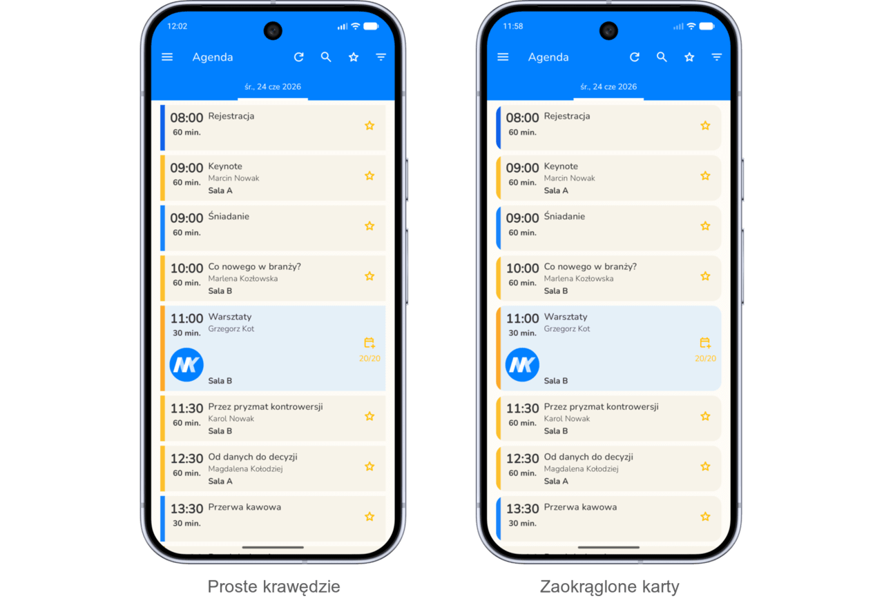
The panel now features ready-made colour schemes: light and dark, with rounded or straight edges. You can use these as a starting point and then customise the details manually: the primary colour, button colours, app background, text, light and dark tabs, form fields and side menu colours.
Rounded or straight design
A corner style toggle has been added to the settings. The app can use a soft, rounded style for tabs, form fields, menu tiles and buttons, or a simpler variant with sharp edges. This is a detail that greatly influences how the app is perceived: a medical congress requires one style, a technology conference another, and a lifestyle event yet another.
Event graphics in one place
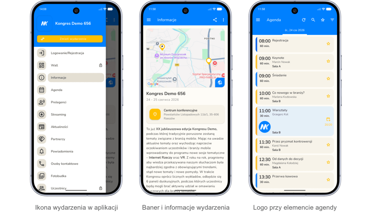
Design 2.0 brings together the app’s core graphics in a single section: the conference icon, the conference banner and two home screen layouts. The required dimensions are displayed next to each field, and the preview immediately shows how the graphics will appear in the app. This reduces guesswork and helps you check more quickly whether the event’s visual identity looks good on a mobile screen.
Menu 2.0 and the new side menu view
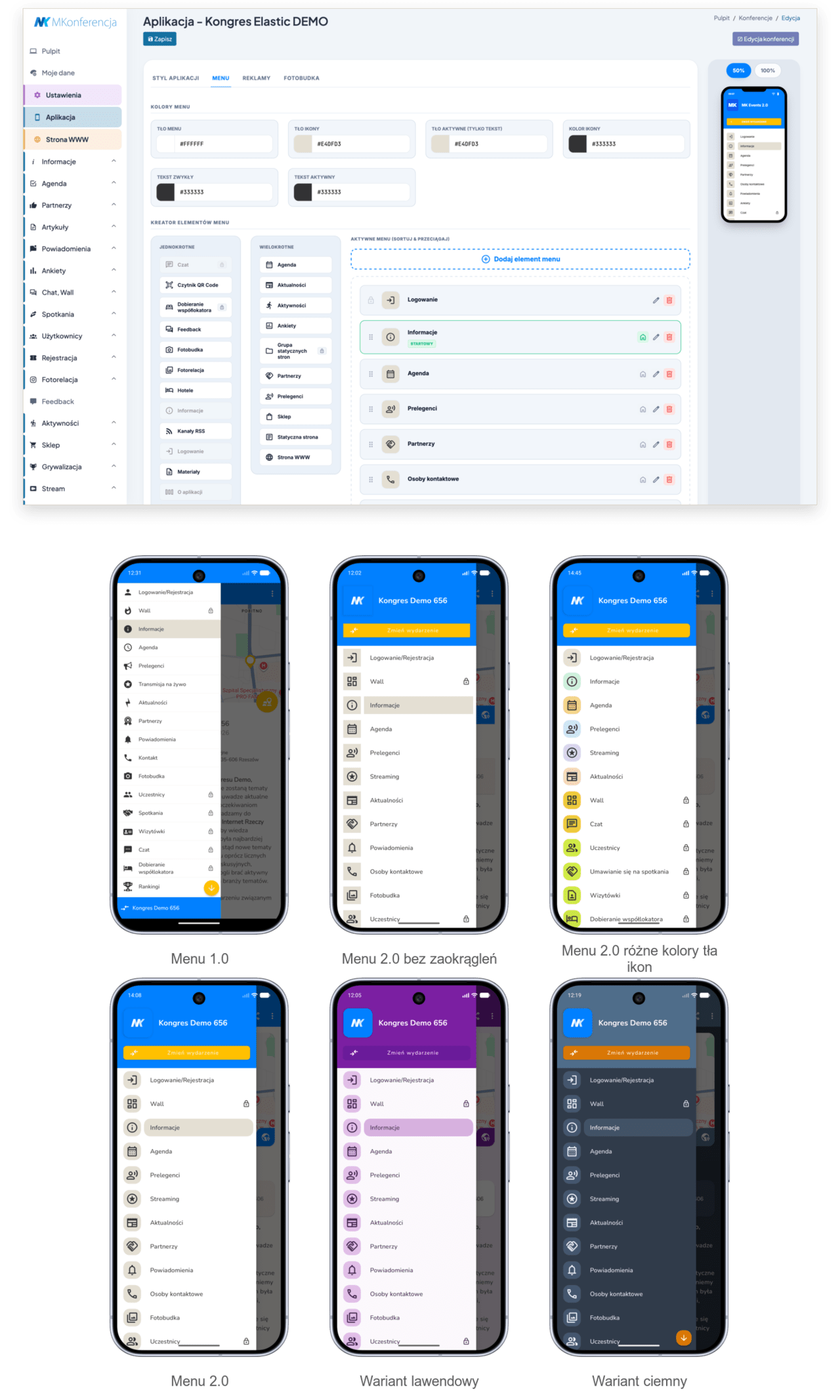
The menu now has its own settings section. You can drag and drop menu items, set the section the app opens to on launch, change icons, titles, icon colours and visibility for user groups. For selected sections, you can also specify categories, display and sorting methods, and the text shown when there is no data yet in that section.
From the user’s perspective, the changes are visible in the new side menu. The menu is clearer, more visually appealing and more closely linked to the event’s identity: it has a separate background, icon tiles, highlighting of the active item and a shortcut to change the event. Items requiring a login are marked in a way that is clear to the user.
Advertisements designed for the app
A separate section for advertisements has been added to Wygląd 2.0. You can add a full-screen banner displayed after the home screen, set how often it appears and how long it is displayed, and add a banner in the agenda footer in 960x150 px format. Adverts can include links, and the panel supports different language versions, so sponsors and messages can be tailored to users.
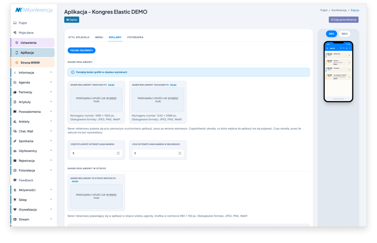
Photo booth with a frame or watermark
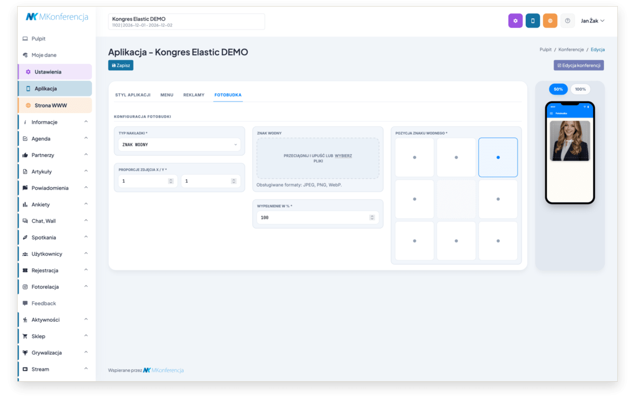
The photo booth has also been moved to the new panel. The organiser can choose whether the graphic should appear as a full frame or as a watermark, and set the position, fill size and aspect ratio of the photo. The preview shows the result immediately, making it easier to prepare a sponsor frame, event branding or a subtle watermark without having to test it blindly.
Migrating from Theme 1.0
The new theme doesn’t require you to start from scratch. For existing events, you can copy the settings from Theme 1.0: colour scheme, menus, adverts and the photo booth. This means that your previous settings serve as a basis for fine-tuning in the new version, rather than something you have to recreate manually field by field.
What this means for organisers
The biggest change is greater autonomy in preparing the app for a specific event. You can more quickly match the style to the visual identity, organise the navigation more effectively, display different sections to different groups, plan adverts and fine-tune additional elements, such as the photo booth. Users notice the difference straight away: the app looks more modern, is easier to read and, right from the start, feels like the event they’re attending.
The 2.0 design marks a shift from a one-size-fits-all events app to customisable settings that give each event its own rhythm, colour scheme and user experience.
Topic cluster
Explore this topic
This resource is part of the Conference and event app . Start with the pillar page or continue to a related guide, feature overview or implementation story.